TQ2 Builds

TQ2 Builds

Redesigning the interface of a theorycrafting website for an ARPG

ROLE

UI/UX Design & Prototyping

UI/UX Design & Prototyping

TIMELINE

Ongoing

Ongoing

TOOLS

Figma

Figma

Problem

Problem

Problem

The existing interface was functional but suffered from weak visual hierarchy, and styling across pages. Inconsistent spacing, typography and color usage also made the experience feel less cohesive than the depth of the underlying tool.

The existing interface was functional but suffered from weak visual hierarchy, and styling across pages. Inconsistent spacing, typography and color usage also made the experience feel less cohesive than the depth of the underlying tool.

The existing interface was functional but suffered from weak visual hierarchy, and styling across pages. Inconsistent spacing, typography and color usage also made the experience feel less cohesive than the depth of the underlying tool.

Solution

Solution

Solution

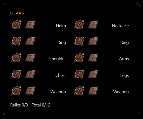
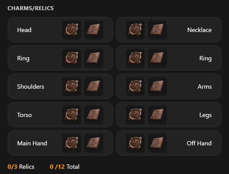
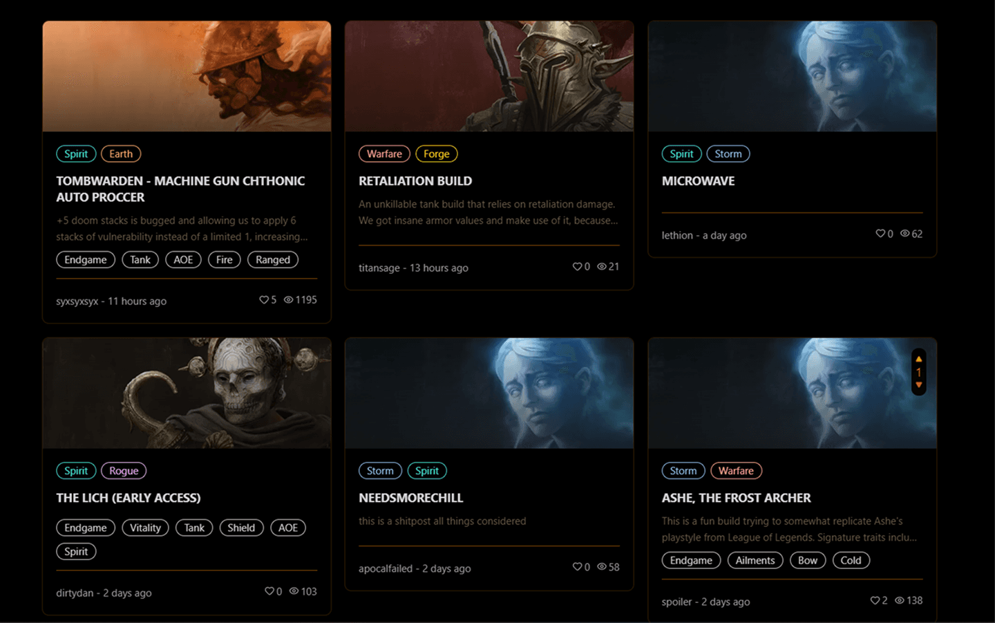
The redesign focused on a visual overhaul and a few UX issues rather than a ground-up restructuring of the tool. I established a consistent typescale and spacing system to improve scannability and introduced a new color scheme. Components like cards, tooltips, and tables were redesigned with clearer contrast and hierarchy, giving the site a more polished feel without changing its existing flows or feature set.

The redesign focused on a visual overhaul and a few UX issues rather than a ground-up restructuring of the tool. I established a consistent typescale and spacing system to improve scannability and introduced a new color scheme. Components like cards, tooltips, and tables were redesigned with clearer contrast and hierarchy, giving the site a more polished feel without changing its existing flows or feature set.

The redesign focused on a visual overhaul and a few UX issues rather than a ground-up restructuring of the tool. I established a consistent typescale and spacing system to improve scannability and introduced a new color scheme. Components like cards, tooltips, and tables were redesigned with clearer contrast and hierarchy, giving the site a more polished feel without changing its existing flows or feature set.

UI & Branding

UI & Branding

UI & Branding

Color palette

Primary

FE9A00

FE9A00

FE9A00

Mastery colors

FF9933

FF9933

FF9933

8C4600

8C4600

8C4600

FF8080

FF8080

FF8080

B21212

B21212

B21212

FF809F

FF809F

FF809F

990F32

990F32

990F32

FFFF88

FFFF88

FFFF88

5E5E01

5E5E01

5E5E01

74D4FF

74D4FF

74D4FF

005E8C

005E8C

005E8C

5EE9B5

5EE9B5

5EE9B5

006649

006649

006649

BF80FF

BF80FF

BF80FF

6000BF

6000BF

6000BF

Neutrals

171717

171717

171717

222222

222222

222222

333333

333333

333333

404040

404040

404040

A1A1A1

A1A1A1

A1A1A1

C9C9C9

C9C9C9

C9C9C9

D4D4D4

D4D4D4

D4D4D4

FFFFFF

FFFFFF

FFFFFF

Typography

Lato

Lato

Lato

H1 48px Bold

H2 40px Bold

H3 32px Bold

H4 28px Bold

H5 24px Bold

H6 20px Bold

Body 16px Regular

Button 16px Bold

Label 14px Bold

Small 14px Regular

Iconography

UI Comparison

UI Comparison

UI Comparison

Build Planner

Before

After

Assigned masteries & skills

Before
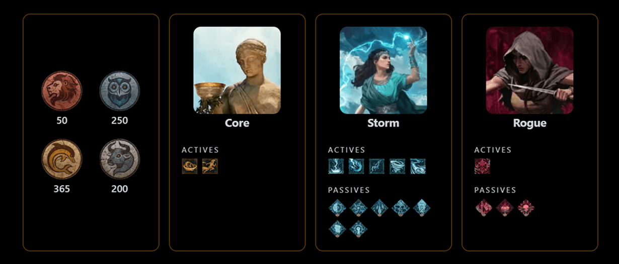
After

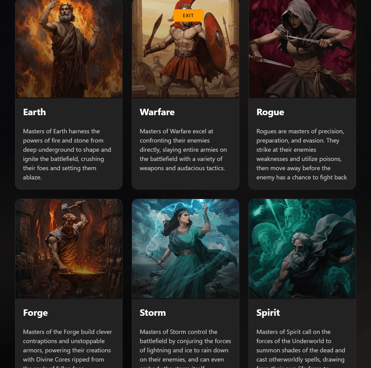
Mastery selection

Before

After
Skill overview (Death Nova/Spirit mastery)

Before

After

Skill tooltip

Skill tooltip

Community builds

Before

After

Profile

Before

After

Create a free website with Framer, the website builder loved by startups, designers and agencies.